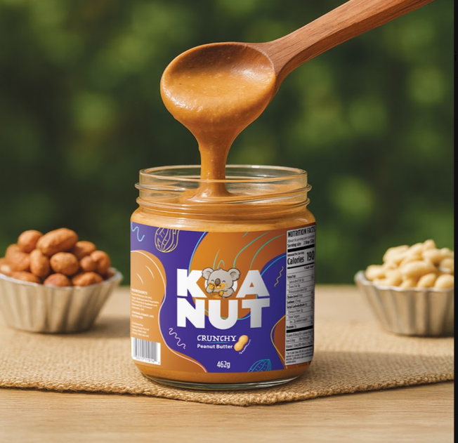
Most people order labels the same way they order business cards. Pick a size, upload a file, pay, wait for the courier. That approach works fine until the roll lands on the bench and something looks off. The gap between what sat on the screen and what ends up wrapped around a bottle catches out plenty of first-time buyers looking for custom labels Australia businesses can actually use on real products. Usually it isn’t one big blunder. It’s three or four small ones stacked on top of each other.
The annoying part is that you can avoid nearly all of it with about twenty minutes of upfront thinking. Buyers who get burned by custom labels Australia-wide rarely get burned by the printing itself. They get burned by decisions made before they ever upload the file. Colour settings, material choice, size, order quantity. Boring stuff, mostly. Boring stuff that decides whether the finished product looks like a brand or looks like a first attempt.
The Colour Problem Nobody Mentions Until The Roll Arrives
Screens glow. Paper does not. That single difference causes more disappointment than any other part of the process. A deep navy that looks rich on a laptop can land slightly grey once it’s printed. Bright oranges tend to lose a bit of punch. It isn’t a printing fault. It’s the difference between light being emitted and light being reflected.
The fix is unglamorous. Order a sample pack before committing to a full run. Look at the stock under the lighting the product will actually sit in, whether that’s a shop fridge, a market stall in late afternoon sun, or a warehouse shelf. Colour on a sample in your hand tells the truth. Colour on a monitor tells a story.
Material Choice Decides More Than Look And Feel
Paper or synthetic seems like a simple fork in the road. It isn’t, not really. Paper suits dry goods, jars, boxes, coffee bags, and anything that lives in a cupboard. It takes ink beautifully and costs less. Synthetic polypropylene handles moisture, condensation and handling, which matters for drink bottles, body wash, serums and anything that spends time near water.
Plenty of buyers pick paper because the sample looked lovely, then discover that a chilled bottle sweating in a fridge turns a paper label into something soft and curling by day three. That may sound obvious written down. It doesn’t feel obvious when the design is finished, and the deadline is tomorrow.
Material also carries a quiet signal about market positioning. A matte synthetic on a skincare bottle reads as considered and premium. The same design on thin uncoated paper reads as a home experiment, even when the artwork is identical.
Ordering Too Few Costs More Than Ordering Too Many
Small runs feel sensible. Test the market, keep the outlay low, reorder when things pick up. The maths says otherwise. Setup work stays roughly the same whether a job is two hundred labels or two thousand, so the per-label price drops sharply as the run grows. Buyers who reorder in tiny batches every six weeks end up paying a premium for the privilege.
There’s a second cost too. Rebranding halfway through a product’s first year because the original artwork never quite worked means every reorder becomes a redesign. Getting it right early protects the repeat purchase rate that small brands depend on, because customers recognize a product before they read it.
See also: The Benefits of Automation for Small Businesses
The Small Details That Quietly Undermine Good Labels
These are the ones that surface at the worst possible moment, usually after the run is already printed:
- Text placed too close to the edge gets trimmed because every press has a small tolerance, and a 2mm margin swallows the last letter of a word more often than anyone expects.
- Low-resolution logos pulled from a website look sharp on screen and fuzzy in print, since a 72dpi image has nowhere near enough detail for a 300dpi press.
- Ingredient lists and country-of-origin statements get squeezed into whatever space is left over, which can create a compliance headache for food, drink, and cosmetic products.
- Label dimensions get chosen before the container is finalised, so a design built for a 500ml bottle wraps awkwardly around the 375ml version launched three months later.
None of these is dramatic on their own. Together they’re the difference between a product that looks finished and one that looks nearly finished.
Before You Hit Order
Nobody sets out to reprint a run. It happens because label decisions get made under time pressure, at the end of a long product development process, when the exciting work is already done. Slowing down for one afternoon at that stage saves weeks later.
Measure the container. Order the sample pack. Check the artwork at full size. Then print with confidence.